
New look marks a century of Larsen Cognac brand
GLOBAL spirits firm International Beverage has introduced a contemporary new look for Larsen Cognac to mark the brand’s centenary year.
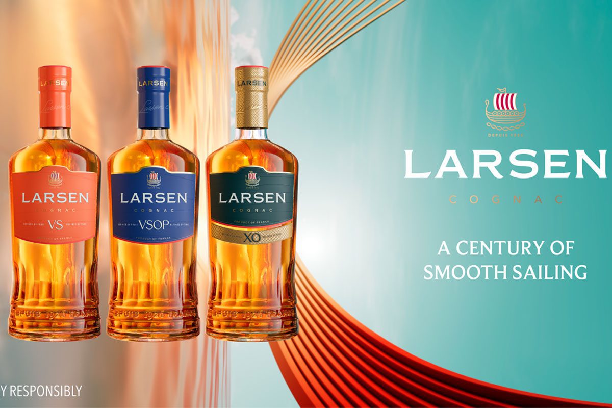
Both the bottle and label design across Larsen’s core VS, VSOP and XO expressions have been re-imagined to reflect the brand’s heritage, premium credentials and smooth, fruity flavours.
The new look will help to aid with differentiation on shelves, say International Beverage, while also enhancing its appeal with modern-day drinkers.
In a bid to blend the heritage with the modern-day, the new bottle features a fluted design around the base of the bottle. Meanwhile, the full bottle has also been made lighter with 8% less glass used in comparison to the previous design.

Along with the new bottle, Larsen’s label has also been shaken up with bold new colours including the brand’s signature statement ‘Depuis 1926 France’ engraving to highlight the brand’s history across every bottle.
And the brand’s iconic Drakkar symbol – a kind of Viking longship – takes centre stage on the label. A mainstay across Larsen for a century now in tribute to its Scandinavian founder, the symbol embodies the skilled craftsmanship and vision of the House that has gone into every bottle over the last 100 years.
Emmanuel Dokhelar, managing director at Larsen Cognac, said: “This is a bold, modern and premium new look for Larsen, which is a very fitting tribute to the past 100 years, but also sets our course for the next century.
“It’s a design that doesn’t reinvent Larsen, but reveals what the House has always been about, which is our dedication to craftsmanship, premium quality Cognac and a sense of conviction and doing things in our own way.
“Each bottle now exudes modern sophistication, with a sense of our unique heritage and flavour profile. We believe this will help to differentiate Larsen and enhance our appeal for modern drinkers around the world, whether they are loyal to Cognac or new to the category.”


