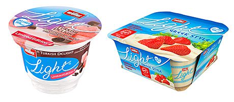
MULLER has given its Müllerlight range a new look for spring.
The revamped packaging has a handwriting-style font and larger images to illustrate the flavours. It’s designed, said the company, to appeal to style-conscious consumers looking for an indulgent yet healthy snack.
The redesign was flagged up with a pack insert during March and the new-look products will be gradually introduced over this month.
The most successful brand in the category over the past 12 months, Müllerlight recently registered its highest four weekly value share at 15.3% in January 2013, according to Nielsen figures. In February, its market share hit 16% for the first time in three years.
The new look packaging will also be used for the Müllerlight Greek Style range.
• Ambrosia Custard is back on screen for the first time in 10 years. The £3m TV and cinema campaign, which aims to remind consumers how custard improves any desert, started last month and will continue during the Easter holidays and throughout this month.
The new ad shows how different families and groups of friends enjoy pudding with Ambrosia Custard. The tag line is: “Ambrosia. This is pudding.”
Brand director Paul Watmore said: “Ambrosia is by far the biggest brand of custard.
“Our research has shown that this campaign will drive a significant and immediate response from consumers, as we remind them about something they love, but maybe haven’t bought recently.
“This TV campaign is just the first activity in what will be an exciting year for Ambrosia, with the launch of a multi-million pound advertising campaign and the launch of exciting new products,” he said.
Images – The Müllerlight range gets a new look with a hand-written typeface and bigger pictures of ingredients.


