
Rebrand highlights craftmanship
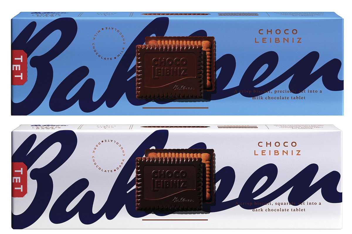
GERMAN biscuit brand Bahlsen has been given a packaging overhaul.
Available now, the new design displays a biscuit in the centre of each package and reflects “the care, craft and attention to detail that goes into making a Bahlsen biscuit.”
The new-look packaging includes a new colour code to help consumers distinguish between flavours on shelf.
The brand refresh has also seen a number of Bahlsen products return to their traditional German names, for example Praline Squares will be renamed Ohne Gleichen.


Bahlsen is also kicking off a £5m media investment this month, running across TV, digital, print, shopper and social media channels.
Jonathan Duffin, chief commercial officer at Bahlsen, said: “Over the last year, nearly one million more households bought a Bahlsen biscuit, meaning that a record number of people are enjoying our products.
“With the relaunch, we aim to build on this success, and believe that our new bold and distinctive brand direction will continue to attract new shoppers and support incremental growth in the special treat biscuit category, while showcasing the brands unique heritage and quality.”


