David Sands’ retail empire is growing once again with the opening of a new store in Falkirk. David’s Kitchen, as the name suggests, is focused on fresh, hand-prepared food including meal solutions and food to go . But design-wise it has a few surprises in store – not least a seated eating area and some Hollywood words of wisdom.
The established retailer headed up a family business that had a 28-store chain of convenience stores across Fife, Kinross and Perthshire that was sold to the Co-op. But he returned to retail with the launch of David’s Kitchen.
The new site is the second to open
under the brand. If the first in Glenrothes showed the creation of the David’s
Kitchen identity, then Falkirk shows its evolution.
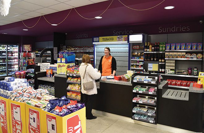
A comprehensive c-store range from Nisa Local fills the shelves of the 2,500 sq ft store, which is large enough and spacious enough to accommodate trolley-sized shopping visits.
The shop stocks and highlights a number of local products from the likes of Stephen’s Bakery and butcher Patricks of Cameron. And of course it provides its very own sandwiches, wraps, salad bowls and ready-meals.
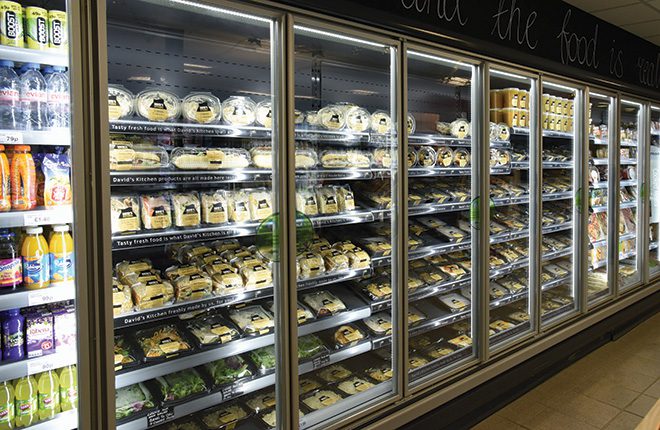
Many of those items and other chilled lines are displayed in the first aisle, which features brightly lit doubled glazed chillers on either side (14 metres in total). Wicker baskets containing fresh produce run down the middle of the aisle, leading customers towards the kitchen counter at the far end.
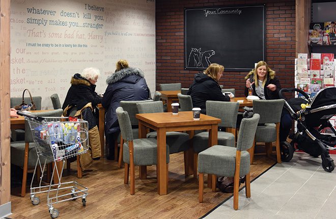
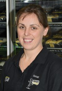
And if they wish, customers can take their food just a few steps from there to the in-store seating area, which store manager Diane Greenough hopes will prove successful enough to expand in the future.
“It’s already been quite popular. Some days all the tables are taken through lunch, which is great to see. The other night a local beekeeping organisation got in touch to see if they could hold their meetings here. It would be nice if we could start attracting groups like that, because they’re more than welcome.”
A seating area is one thing David’s Kitchen in Glenrothes doesn’t have, and one of a number of points of difference between the two stores that cropped up during the design process.
“As you tweak one thing, the things around it have to change,” said Diane. “To make one change here, adding the seating area, was actually quite big. The council told us we had to have more toilets, so then the whole back of the store had to be moved about and that changed what was happening at the front of the store because we flipped the chillers into the first aisle.
“The food-to-go counter was originally going to be a lot smaller, but building on our confidence from Glenrothes we extended it another two and a half metres. We could still do with more space.
“You would definitely know the stores were part of the same company, but the design’s a bit different. It’s a question of building your confidence, figuring out what works and what doesn’t work and going forward from there.
“The shopfitting was done by Vertex who are very good. They’re quite flexible. Even when you get about halfway through a development and decide you want to change something they’ll just roll with it.”
The store also has a few quirks that are all its own – handwritten chalkboards in place of vinyl graphics and a wall of movie quotes in the seating area, meticulously painted by a member of staff.
“We tried to make it a wee bit different so that when you’re sitting here you’re not necessarily just playing with your phone. We didn’t want it to feel like just another convenience store,” said Diane.
“With Glenrothes we played it quite safe, went with what we knew, whereas here we got a bit more adventurous. Where we could, we opted for something more personal that makes us stand out.”
