Scotmid sees a food store and it wants to paint it black! The co-operative has introduced a new top level in its portfolio. SG visited its latest premium fresh unit.
EDINBURGH-based co-operative society Scotmid has been diversifying its food stores in the last year. And now its special food-led, premium-look, black and green outlets, which it launched with the refit of its Warrender Park store in the capital city, are beginning to make their presence felt across the country.
As we reported in our interview with Scotmid CEO John Brodie in the last issue of Scottish Grocer, the company has taken the view that one style just won’t fit all of its 190 or so food stores. In some sites it reckons it needs to reach out to consumers who are especially interested in food – in its quality and often in its provenance. Frequently those consumers will be people who like to cook from scratch. But equally they may also include those looking for quick meal solutions … but ones that carry the look, feel and taste of authentic meals from many cuisines.
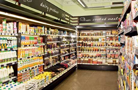
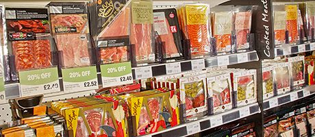
On page 101 we see the highly organised layout of the extensive meals-for-tonight section, the use of hanging display fixtures for the large deli section and the carefully positioned and very successful serve-over bakery display unit at the store’s till point.
Its answer is in its new portfolio of premium fresh stores. Often they are in cities, always they carry a range that suits their quality-conscious, food-loving customers and, crucially, they’re designed and fitted out to look the part.
 One of the latest is at the western edge of the heart of Edinburgh in Haymarket Terrace – immediately opposite Haymarket Station. Its refit, which saw the store transformed into the latest of the market-style, black and green themed stores, was different from others, however. This time the team wasn’t changing an existing Scotmid outlet, it was applying the Scotmid premium fresh style to an acquisition. The Haymarket shop had actually been established for some time as a serious food and drink unit – it had been one of the Edinburgh chain of Margiotta stores.
Its recent refit makes it the fifth of the premium fresh Scotmids in the Edinburgh area, along with Warrender Park, Marchmont, Barnton and the recently opened Saughton Hall. Outside the capital the firm also has or is refitting stores in its black and green premium fresh livery in Newport close to Dundee, in Clarkston near Glasgow and at Bieldside in Aberdeen.
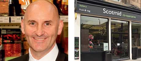
Kevin Lowe, Scotmid’s format implementation manager, who works on refits in all the Scotmid shop styles, is one of the people most involved in bringing the society’s vision for its premium fresh stores to life.
He’s been with Scotmid for 13 years, spent time as a regional business manager looking after 25 west of Scotland stores, and had a period in charge of the firm’s stores in Aberdeen and Inverness. He’s been overseeing refits for six years.
The green and black theme is established in all of the company’s food-led stores and it runs consistently though all aspects of each outlet, encompassing everything from exterior signage to staff uniforms.
“Our market research showed that the colour black seemed to represent premium,” Kevin explained.
“Customers don’t expect to see a Scotmid store put together like this– but it is premium and it is different.”
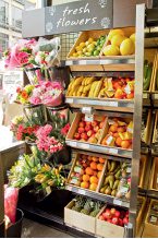
The exterior signage itself is understated. The windows at the Haymarket Terrace entrance are large, clear and uncluttered, and designed to allow customers to see inside easily. And the first thing they’re intended to see, both when they look through the windows and when they step through the door, is fresh produce – in particular, attractive and inviting flowers and fruit.
Kevin explained the redevelopment process. “The site acquisition person buys the property and we come in, survey the building, draw up a plan of how we see it working and take that to the chief operations officer,” he said.
The Scotmid format group works in conjunction with Glasgow-based Smith Finlay Architects. The premium fresh style stores have been shop-fitted by Glasgow firm City Building & Electrical Services. The fitting at the 1500 sq ft Haymarket Terrace site was completed in one and a half weeks.
An ideal site for the style will have high ceilings and abundant natural light.
Where that isn’t the case the firm is willing to make it so! At Edinburgh’s Saughton Hall store it spent £25,000 to knock away existing brickwork and create a new shop front with large windows.
At Haymarket Terrace, however, it was more a case, in terms of the shell at least, of preserving what was already there.
Many original features, including an ornate ceiling and windowed roof, are now showcased.
Two large chandeliers complement the cornice work and functional but unobtrusive energy-saving lighting rafts are suspended some distance from the ceiling.
The windowed roof ensures plentiful natural light during the day and as night falls, the store takes on a different ambience, with the sky and stars visible through the high windows.
Air vents have been painted green to merge into the background. The black Scotmid panelling is fixed onto a specially constructed fitting that keeps it clear of the walls. And wire shelving is used extensively. The idea, explained Kevin, is to “let the store breathe”.
Previously, there were large refrigeration channels in the middle of the shop, narrowing the aisles to less than a metre wide in some areas. Now the chiller units (including 13 bays of chilled food and five bays of chilled beers, ciders and wines) run along the walls, freeing up space and making life easier for parents with buggies.
All refrigeration bays are remotely operated, with motors located outside the shop. There are many benefits but one of the most important, Kevin explained, is that each chiller has more available selling space – six shelves rather than five.
Scotmid runs open-deck units at Haymarket Terrace, which allow for easy customer access. However in future the company does intend to buy fridges with doors to minimise energy use.
The format team lays out the store in keeping with its thoughts on the ideal consumer journey around the shop. Particularly important is the sequentially arranged selection of convenient options for those who are shopping for dinner. The ‘something for tonight’ section is organised to provide 45 options for easy meals.
But there’s also a route intended for those who want buy just a few items, often for instant consumption. That’s designed to allow the on-the-go customer to move quickly between sandwiches, snacking items, soft drinks and coffee, finishing up at the serve-over bakery unit at the till point.
A juicing machine has been installed. It holds fresh oranges and customers can either juice the fruit and fill an empty bottle or grab a recently prepared portion. At £1.49 for a 330ml bottle it’s popular with office workers and parents with children in tow. The store is currently selling around 100-150 bottles a week. “It was relatively easy to do, it’s not a space-hungry piece of kit, it only takes up 700mm”, said Kevin.
Next to the orange juicer is a Costa coffee machine, located close to morning goods to make it easy to highlight link deals – for coffee and croissants, for example.
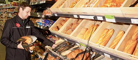
The large serve-over bakery display unit at the till point carries fresh cakes as well as hot savouries and earns the right to its prominent position by attracting customers all through the store’s 6am – midnight working day.
“At Haymarket a lot of guys come out of the pub and they can buy hot savouries at 11pm at night,” Kevin said.
The store features a range of alcoholic drinks that includes premium products like artisan beers, boutique spirits, and fine wines and Champagnes, many of which are on open-display shelves. The shelving units holding the wines and premium spirits are designed to give the look and feel of a specialist wine merchant.
For the future the idea is, said Kevin, to take stock and use the knowledge gained in the premium stores to figure out what might work throughout the estate.
“So far people love the larger range of produce and fresh vegetables. We are getting great performance from the 45 different meal solutions as well as from the breads and local produce such as cheeses.”
He’s enthusiastic about the programme, loves going into a shop with a blank canvas and enjoys seeing the eventual outcome.
“It gives lots of opportunities to be creative,” he said.


