

New design nods to Scottish roots
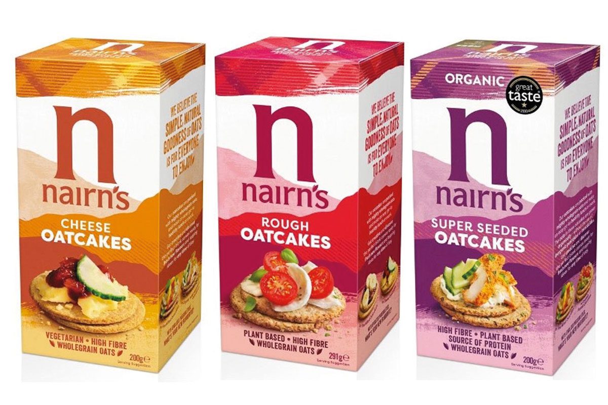
OATCAKE producer Nairn’s has unveiled a packaging overhaul which celebrates its Scottish heritage.
The design – created by design agency This Way Up – includes a new eye-catching colour palette and the outline of Scottish munros.
The new-look packaging also includes images of oatcakes served with a range of ingredients, which Nairn’s hopes will widen the appeal of the oatcakes and show they are “so much more than a biscuit for cheese.” The refresh aims to position the brand within a “lifestyle-led sector” and entice younger shoppers.
Nairn’s flagship oatcake range has already moved to the new design. It will be rolled out across the brand’s portfolio of products in the coming months.
Emma Heath, head of marketing at Nairn’s, said: “One of Nairn’s founding principles was for our products to be simple, natural, wholesome and delicious – a philosophy that still resonates with modern-day consumers and is embraced by Nairn’s loyalists in the UK and further afield.
“We worked extensively with consumer strategists at Map The Territory to better understand the changing health landscape and consumer needs, and this research has provided a solid foundation for the design work which is a significant step forward but still instantly recognisable as Nairn’s.
“The rebrand is designed to take our ever-expanding range of products to an even wider audience by making the brand more visible, modern, and appealing on shelf and highlighting its relevance to today’s healthy eaters as an integral part of their lifestyle, with taste and versatility at its heart.”


