Encouraging French indulgence with a new LU-k
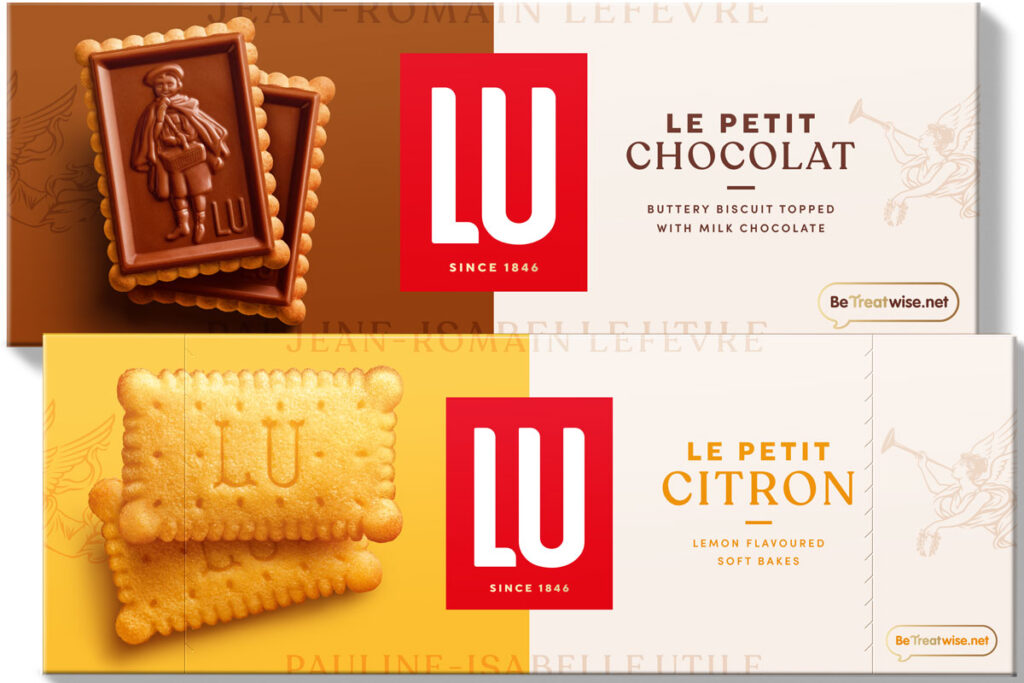
FRENCH biscuit brand LU has unveiled its new design and visual identity across its portfolio of variants.
Aiming to redefine indulgence within the biscuits category, the new makeover for LU aims to cement it as a premium brand with a focus on the French heritage of the product, says UK distributor Mondelēz International.
The entire range is now presented using distinctive and bold colouring to help encourage stand-out on the shelf as well as to differentiate between the different variants.
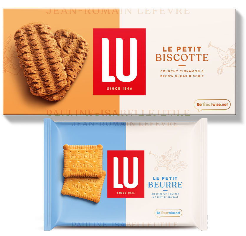
Each pack also carries some real product images to showcase the high quality of the biscuits inside as well as an image of the LU angel Pheme which the brand says it uses as a quality mark.
Mondelēz has said that consumer feedback for the new look has been massively popular so far with many describing the packaging as premium, high quality, classic and “more modern than normal biscuit packs.
The brand’s in-store messaging will also reinforce this with consumers, with a tagline ‘New design, same beautiful biscuits’ to help reassure consumers that they are stilling getting the same product as they always have.
Kelly Lawrence, brand manager for LU at Mondelēz International, said: “At LU, we are excited to introduce our new distinctive and beautiful packaging to our biscuits.
“This launch is more than just a design change. It’s an invitation to experience ‘Le Petit Pleasure,’ bringing a touch of French elegance and delight to every LU moment.
“With this new pack design, we’re sure that LU can bring the French attitude of joie de vivre – the art of living with enjoyment and passion while savouring every little moment – to the category for shoppers to enjoy.”


