Premium lager brand rolls out updated pack design
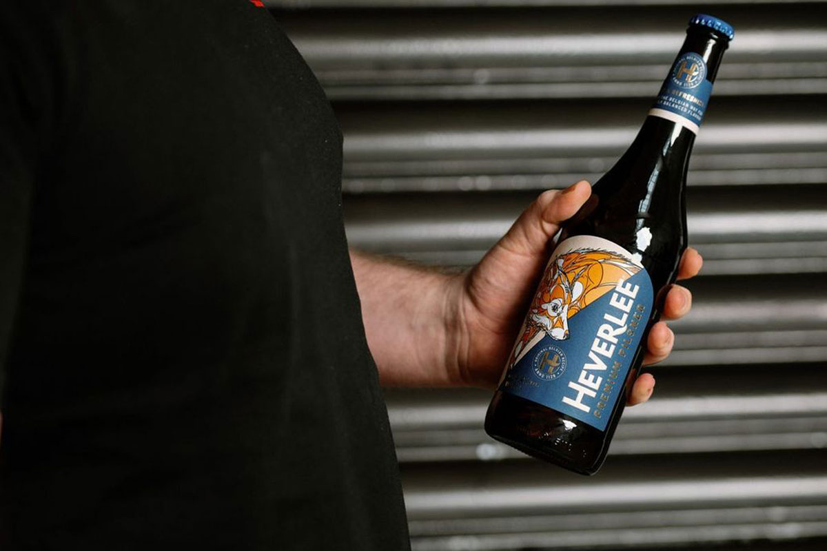
PREMIUM pilsner lager brand Heverlee has unveiled its new brand refresh, complete with a new design across its packaging.
The new look sees a continued premium look across packaging for the brand, according to parent company C&C Group, with the iconic Heverlee fox, designed by renowned Belgian-street artist Dzia, still at the heart of the design.
Further to this, the updated design includes some enhanced gold detailing across the label as well as a subtle nod to the brand’s fox mascot in the wordmark.
Consumer feedback from across the whole of the UK has seen a positive result for the new look, with respondents across Scotland, England and Norther Ireland all stating that the new design looked distinct, unqiue, premium, modern and refreshing.
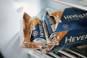
The new updated design can be found across bottles of Heverlee as well as the premium brand’s 10-pack of cans.
Michael McAdam, brand manager at Heverlee, said: “With volumes increasing 9% in the first half of FY24, compared to H1 FY23, Heverlee is going from strength to strength and as we move into FY25 we want to accelerate that by continuing to premiumise across the brand.
“We have carefully evolved Heverlee’s visual identity to bring in gold detailing and softer curves on labelling, while making more of our fox icon.
“The feedback we have had from consumers about the new look is really encouraging and we are confident that we’re setting the brand and our customers up for continued growth across the on and off-trade in the years to come.”


