Our workSHOP special looks at how Mondelez International has worked with different types and sizes of c-store to make confectionery category management pay off.
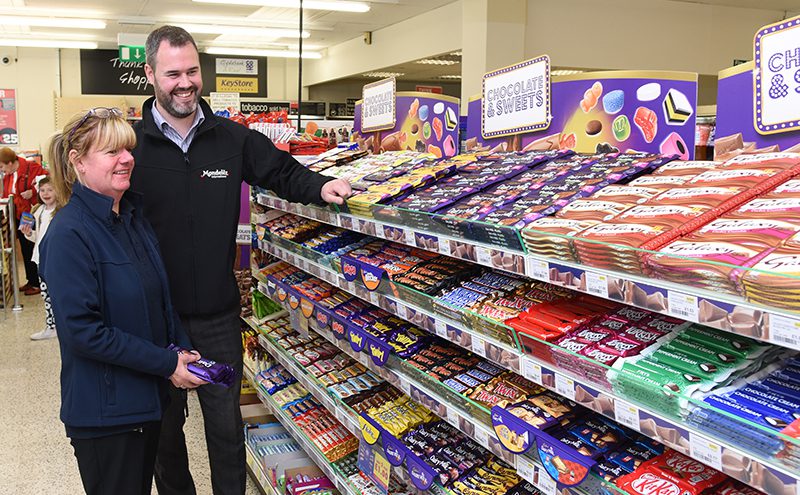
CATEGORY management, it’s a buzz term certainly. Does it really make a major difference? And what’s in it for retailers? Scottish Grocer visited two different stores of very different sizes with Cadbury brand owner Mondelez International’s field sales development manager Caroline Buchanan, and her colleagues Ross Gibson and Dawn Bunce, to find out the effects of major reworkings of the confectionery fixture in the large Clydebank Co-op shop in Dalmuir near Clydebank and the compact privately owned Hornbeam Store in Cumbernauld.
One of the first things to be aware of, Caroline said, is there isn’t a ‘one size fits all’ solution to category management, every store is different. For that reason the company doesn’t work to set planograms. Instead it has, with the help of extensive consumer insight research, developed a series of merchandising principles that can be moulded and tweaked to suit each shop.
The firm’s merchandising principles are based on deep understanding of consumers behaviour and actions in stores, from how consumers first see the fixture to how they finally select a product.
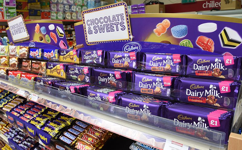
So first and foremost it wants to work with retailers to make the main confectionery fixture as easy to see as possible. That’s achieved partly by location and partly by using highly visible POS material such as the unbranded “Chocolate and Sweets” header boards it provides.
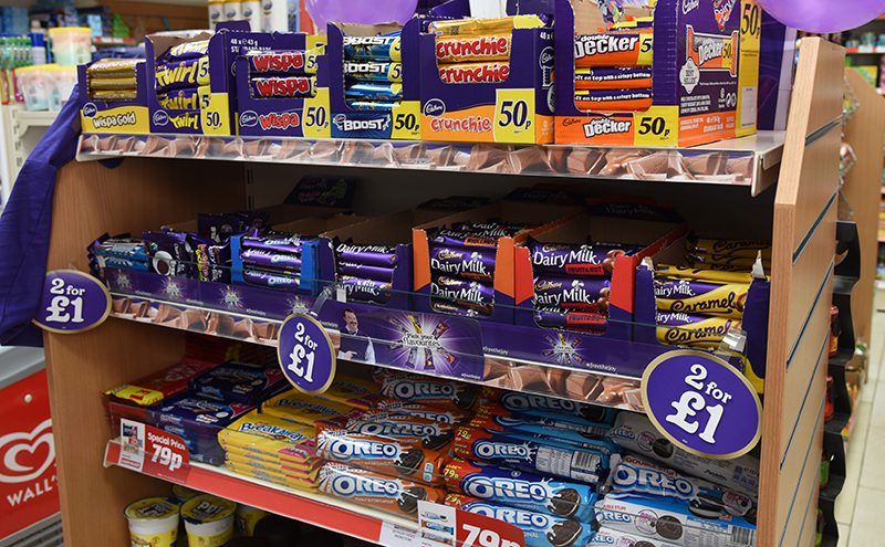
Next the firm’s sales development executives lay out the shelves in a way that makes it easy for the consumer to shop. And that means a crucial break with former practice where products were often placed alongside others made by the same firm. Instead, products are grouped together first by pack format – hanging bags together, tablet chocolate in a dedicated tablet chocolate section, and individual countlines positioned next to other countlines.
Within those sections products are grouped by style and type, which is defined by how consumers view and use them – so chocolate bars with chocolate bars, biscuit-based lines with similar products and chewy “big eats” also in their own section.
Overall best-sellers take the best-selling positions on shelf, and that’s true also within each of the product groups. Well-positioned best sellers help attract consumers and make it easier for them to shop the fixture.
And clear pricing is, she explained, critical to the final part of the process – translating all the seeing and showing interest into a purchase.
Mondelez International sales development executives typically visit stores once a month to manage the category, discuss new products and tweak layouts.
Does it work?
At the Clydebank Co-op store in Dalmuir, a substantial c-store with a five-metre confectionery fixture and a number of off-fixture displays, manager Lorraine McKellar said confectionery sales had increased 21% in just over a year since the new plan had been implemented.
“The layout’s very good, it has had a big impact,” she said.
“Block chocolate does very well. Price-marking definitely helps.”
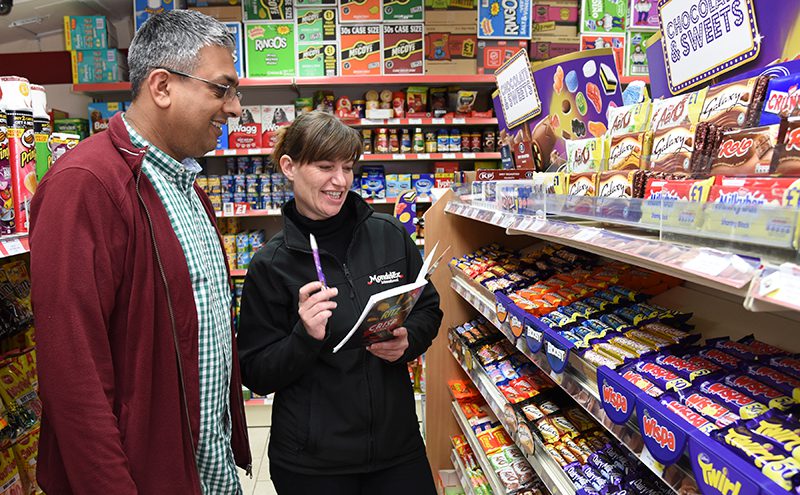
Hornbeam Store in Cumbernauld is a long-established local c-store in a residential area.
It has a confectionery aisle where chocolate shelves face candy and other confectionery lines.
The chocolate fixture plays an especially important role in attracting the attention of shoppers as they enter the store .
Owner Waseem Shad has seen remarkable growth in confectionery sales in the nine months since the section was redone. He views the category management effect as so important that he tells staff that no-one is allowed to change the confectionery layout without consulting him directly.
“We were previously blocked by company. Now we’re making much more,” he said.
“I’d say we are 25 – 30% up. That’s across the range, not just Cadbury.”
That, said Caroline, is what it is all about: “If the category grows we grow. Our job is to make the category work for the retailer.”
Top tips
• Focus on the best selling lines
• Have a confectionery main fixture and secondary sites
• Stock self eat, sharing, and gifting confectionery
• Place best sellers on the “hot spot” of your main fixture
• Dual face the very top sellers but only where space allows
• Use POS material
• Have displays in store when products are being advertised
• Keep display fully stocked and tidy
• Group products with similar attributes next to each other
[hr]
Clydebank Co-operative, Dunn Street, Dalmuir
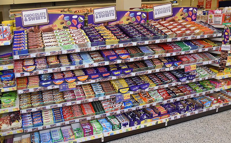
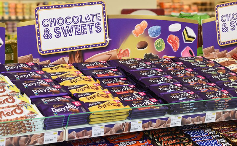
• Confectionery grouped by pack format with sharing candy and other bags in a vertical block at the left of the fixture
• Unbranded category header boards help attract and direct shoppers to the fixture
• Unbranded POS fins help segment the fixture and make it easier to scan and shop
• Best sellers take the most prominent positions at the centre of the fixture and best sellers within different types of confectionery take the key positions in their relevant sections.
[hr]
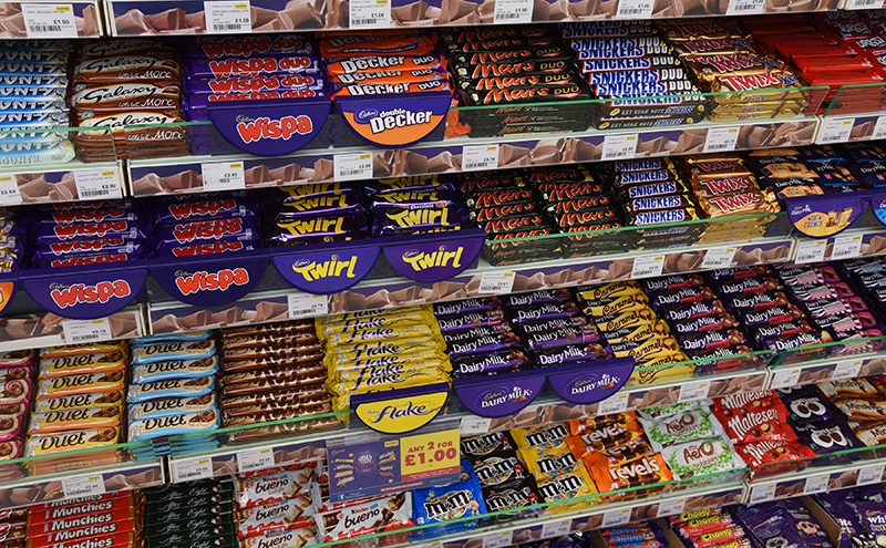
Hornbeam Store, Cumbernauld
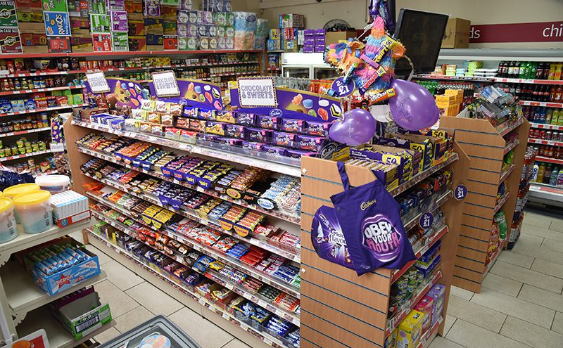
The main confectionery fixture is sited to be immediately visible to customers entering the store, layout reflects sales figures and consumer shopping patterns rather than supplier ownership of brands, and double facing is used on key brands.
The Hornbeam Store chocolate fixture faces shelves containing bags of candy and other products, so it draws shoppers into the entire confectionery category.
• Once again the unbranded header boards clearly signpost the position of the confectionery fixture in store.
• At Hornbeam Store the main point of vision, featuring the very best sellers, is actually slightly to the right of centre – to reflect where shoppers’ sight first lands when they enter the shop.
